Wow, I haven't done a rant in ages. I try not to just because most folks don't like listening to/reading em, but this is both a review and a rant. Well, psuedo-review, because I heard one of the tracks on the radio.
Let me start the whole thing out by saying I am a HARDCORE Motley Crue fan. I own most, if not all of their studio albums. I started reading The Dirt at age 12, and it's probably part of the reason I'm so twisted. I was one of the 70 people featured in the Chronological Crue compilation of "What Motley Means to Me." I think I was one of the youngest people featured as well. (I lost my book, and I'm very heartbroken about this.) With all of these things in mind, I feel a great sense of disillusionment as I found out about the recent release of yet ANOTHER Motley Crue "Greatest Hits" album. Not only is this riding on the coattails of the last one (Remember Red, White & Crue? The anthology that effectively reunited the band? Yeah. That was in 2005. ) but there is an overwhelming lack of any real thought into this project altogether. Even with Nikki in charge of the company's label (Eleven Seven records, if I'm not mistaken) this doesn't look like something the guys had any thought/hand in.
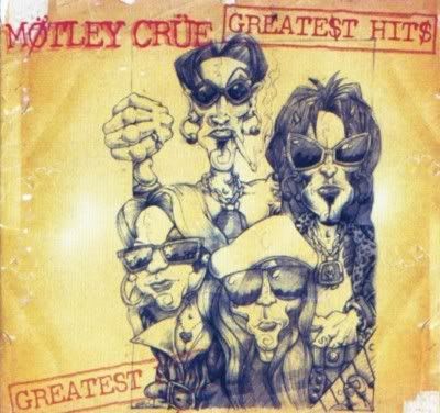
Let's take a look: We'll start with the cover art.

This is the album art for Motley Crue: Greatest Hits 1998. New art, still kind of messily done, but not much thought into it. Had two remixes on there: A remix of Glitter (not seen on the original Generation Swine album) and a remix of Shout at the Devil (the same one they recorded around the Generation Swine album).

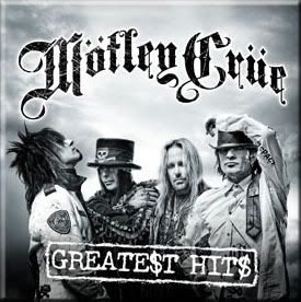
Aaannd here is our new beauty. Same logo for the Greatest Hits part, reusing a promo photo from a Paul Brown shoot for Saints of Los Angles (If you're going to have someone do a photoshoot, might as well use ALL the photos, right?). It's a great photo, but the logo for Greatest Hits just seems completely off with the overly Gothic Script of the MC logo. Maybe it's just the graphic design student in me, but reusing of past elements in this manner just makes it seem more slapped together than the 1998 Greatest Hits album (which was apparently slapped together in the first place.)
This album features three new-ish songs: If I Die Tomorrow (off of Red, White & Crue - honestly, does that count?), Saints of Los Angles, and a remix of Animal In Me. I use the term "remix" lightly. I managed to catch Animal in Me on the radio and nearly cried. They added effects and called it a remix. Sure, there were some extra strings in multiple parts, but no new verses, and it was the same length as the previous version. Was it a great song? YES. But to call it a remix? Please. The guys would have been better off releasing THIS version of it on Saints of Los Angles and calling it a day.
In the end, this really has to make me wonder what the hell is going on. Cruefest has been a success both on its inaugural year and this one. Sixx has more projects going than he can shake a stick at, and I'm pretty sure some of the others do as well. Does the release of an album such as this disappoint me? You bet your ass. Not only is it poorly timed, but the "pitch" of the album (ie, the reason you'd want to go and even BUY the damn thing) isn't even worth it. Do I have less of a high regard for the boys? kinda. and you bet your ass I'm not going to buy it.
This thing had been bugging me for the past couple of months, so I just had to get it off of my chest. Let me know what you think.
Will have more on actual ART stuff later. Thanks for being patient.
- NG

